


Collapsible navigation menu with HTML, CSS and JS
Create a simple collapsible side menu using HTML, CSS and vanilla JavaScript.


Learn to make a sliding navigation panel for your website!
Having your website be responsive is so important and necessary these days, but that doesn't mean you have to sacrifice aesthetics and fun features! Follow along to learn how to make a simple navigation menu that slides in and out at the click of a button, perfect for small viewports. Full code can be found here.
Let's dive right in!
HTML
<nav id="sidenav" class="sidenavbar">
<a href="#">Home</a>
<a href="#">About</a>
<a href="#">FAQ</a>
<a href="#">Blog</a>
<a href="#">Contact</a>
</nav>
<button aria-expanded="false" class="openbtn" id="openBtn" aria-label="mobile navigation" onclick="toggleNav()">
<span id="chevron">»</span>
</button>
Using <nav> we add our links. Focusing on UX we have aria-expanded="false" that changes to true when the menu is opened, which indicates to screen reader users the visibility of the menu. I opted to make my menu a bit fancy using a chevron that rotates to indicate which direction the slider will go onclick, feel free to use what you'd like.
CSS
On to the styles for the menu itself:
.sidenavbar {
    height: 100%;
    width: 0;  /* initial width is set to 0, slide happens with JS */
    position: fixed;  /* keeps sidenavbar in place */
    z-index: 1000;  /* makes sidenavbar stay on top */
    overflow-x: hidden;  /* prevents unwanted scrollbar */
    top: 0;
    left: 0;
    background-color: darkBlue;
    transition: all ease-in 0.5s;
}
Link styles
a {
        padding: 7px 14px 3px 14px;
        text-decoration: none;
        font-size: 20px;
        color: lightGreen;
        display: block;
        transition: all ease 0.3s;
        text-align: center;
}
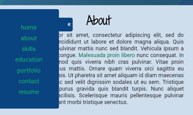
Styling note: on my personal website I have the height attribute set to auto, and a class with styling margin-top: 35px added to the first link to create a more balanced look, like so:
Play around and see what you like!
Now let's style the button used to open and close the menu:
.openbtn {
    cursor: pointer;
    color: white;
    background-color: darkBlue;
    border: none;
    height: 40px;
    width: 40px;
    position: fixed;
    top: 75px;
    transition: all ease-in .5s;
/* rounds the upper right and lower right corners */
    border-radius:  0 5px 5px 0;
    z-index: 999;
}
.openbtn:hover {
    background-color: lightGreen;
}
Pretty straight forward; the most essential part of the openbtn class is the width of the button, which I'll explain shortly.
Styles for the chevron:
#chevron {
    transition: all ease-in .5s;
    float: right;
    font-size: 20px;
    margin-right: 5px;
    color: #FFF;
}
Observant readers may have noticed the transition attribute of the sidebarnav and openbtn classes and chevron IDs are all the same. This is critical to ensure a seamless transition. If you change the values, just make sure to change it on all three or things may look wonky.
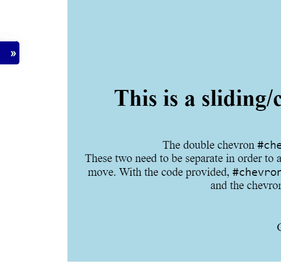
The float position of the chevron is significant. When the button is clicked to open the menu, the button's width actually expands, which makes the button appear to slide. Here's a visual with the opacity of the menu bar set to 0.5 to show what's happening behind the scenes:
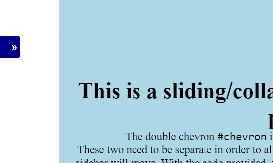
If the chevron floated left, it wouldn't be visible when the menu is open.
Now let's get to making this menu slide!
JavaScript
In the HTML we specify the function of toggleNav to run onclick, so that's where we'll begin:
function toggleNav() {

}
We'll need some variables: one for the menu itself, one to rotate the chevron, one to move the button, and one for the aria value.
var sidenav = document.getElementById("sidenav"),
    chevron = document.getElementById("chevron"),
    btn = document.getElementById("openBtn"),
    ariaValue = btn.getAttribute("aria-expanded");
You can opt to select the elements by class or opt for querySelector, it's up to you. The ariaValue needs to remain a .getAttribute because we'll be setting it attribute for accessibility.
Now, in the CSS the menu's width is set to 0. So, until the button is clicked we can't see the menu. JavaScript will make that magic happen in the first line:
sidenav.style.width = sidenav.style.width === "175px" ? "0" : "175px";
chevron.style.transform = chevron.style.transform === "rotate(-180deg)" ? "rotate(0deg)" : "rotate(-180deg)";
btn.style.width = btn.style.width === "215px" ? "40px" : "215px";
Using a ternary operator, we're checking the value of width for the menu. If it's 0, the value is changed to 175px, which opens the menu. If width has a value of 175px, the value is then changed to 0, closing the menu.
The chevron also has a ternary operator, too, which causes it to rotate 180 degrees.
The button's width was mentioned earlier to be significant, and here's why: to properly have the button move out as if attached to the menu, the ternary needs to compare the widths of just the button, to the button plus the width of the menu. So, if you change the menu or button width in the future, these values will also need to be updated.
Now let's finish up our function by addressing aria-expanded, so screen readers will know if the menu is open or closed.
ariaValue = ariaValue === "true" ? btn.setAttribute("aria-expanded", "false") : btn.setAttribute("aria-expanded", "true");
Remember when we defined our variables, we used getAttribute to find out the value of aria-expanded. Now we'll set the attribute accordingly. It's not difficult or fancy but incredibly important for accessibility.
And that's it!
Pretty simple, yeah? I had a lot of fun making this collapsible menu and hope you've enjoyed following along!