


Photo by Michael Payne on Unsplash
Make a Shimmer Load Effect - HTML, SCSS
Learn how simple it is to create a stylish loading effect with HTML and SCSS


Want to spice up your loading screen? Follow along and we'll make a nice, shimmery loading effect like this one:
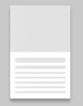
We're going to be making a product card with an image, heading, sub-heading and description elements. Below you'll find the starter HTML and SCSS.
If you get confused along the way, you can check out the finished code here.
Quick terminology break
What is a CSS animation? It's used to gradually change from one style to another. When using animation, as opposed to transition or transform, you need to use keyframes, which contain the different styles that will be applied to the element.
Alright, let's move on to the starter code!
HTML
    <main>
        <div class='card'>
            <div class='product-image'></div>

            <div class='desc-wrapper'>
                <p class='heading'></p>
                <p class='desc'></p>
                <p class='desc'></p>
                <p class='desc'></p>
                <p class='desc'></p>
                <p class='desc'></p>
            </div>

        </div>
    </main>
Note the five p elements with .desc, they can be used to hold product information such as price, color, quantity et cetera. You can use more than one p element to get the multi-line effect, or use a single p that's bigger (to take up more space and have a fluid transition to the actual content) if you're using full paragraphs of text.
SCSS
.card {
    display: flex;
    flex-direction: column;
    width: 325px;
    height: 500px;
    background-color: #fff;
    border-radius: 5px;
    .product-image {
        width: 100%;
        height: 250px;
        border-radius: 5px 5px 0 0;
    }
    .desc-wrapper {
        padding: 5px 25px;
        .heading {
            width: 100%;
            height: 25px;
            margin-top: 25px;
            border-radius: 50px;
        }
        .desc {
            height: 16px;
            border-radius: 50px;
            width: 100%;
            margin: 15px 0;
        }
    }
}
Feel free to adjust the HTML or SCSS to fit your needs, just make sure all elements of the loading effect will be applied to have a height and width property, otherwise they won't be visible until they're filled with content.
Okay, onward to the fun stuff!
We want the product-image, heading, sub-heading and desc elements to shimmer while they're waiting for data to display, so we'll give each of them a .shimmer in our HTML. Now let's define .shimmer in our SCSS and make the magic happen!
I'll start off with the full code for the animation styles, and the finished product will have the shorthand animation property. Below is an example from the previous link. It condenses this:
div {
  animation-name: example;
  animation-duration: 5s;
  animation-timing-function: linear;
  animation-delay: 2s;
  animation-iteration-count: infinite;
  animation-direction: alternate;
}
into this:
div {
  animation: example 5s linear 2s infinite alternate;
}
It's a big space saver, but feel free to use the longhand version if you wish!
Our .shimmer will be pretty straightforward, there are a few key features to make it work though.
animation
I named it shimmering, which will be used later for the keyframes. Duration is up to you, I think something between two and four seconds looks best; if you go much longer, the user may not even see the loading effect. Along the same vein, I didn't want a delay. I kept the speed even for the duration, and set it so the animation loops for as long as it takes to load the content. Here's what that looks like in longhand:
  .shimmer {
    animation-name: shimmering;
    animation-duration: 2.1s;
    animation-iteration-count: infinite;
    animation-timing-function: linear;
}
and shorthand:
.shimmer {
    animation: shimmering 2.1s linear infinite;
}
We've got our animation, but what is it, y'know, animating?
The background!
... Wait, what?
Okay, a really big background!
...
I'll explain: to make the elements look like they're shimmering, we're going to have an oversized linear-gradient background that will repeatedly move from left to right. Still a little confused? Me too, let's crack on!
background-size
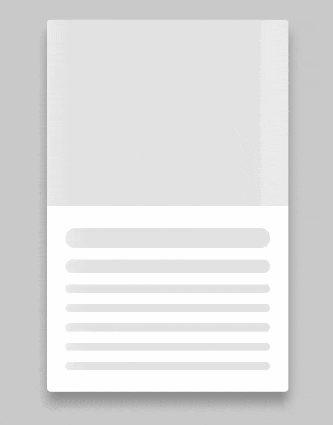
We're going to add a declaration to .shimmer to give us the really big background: background-size: 1300px 100%. The first value of background-size is the width, and we want that to be at least twice the value of the element that this class is being applied to. Why the oversized background? Without it, the shimmer effect will loop much faster and it won't look as nice, like this:
linear-gradient
Now let's color in that really big background with a linear-gradient, this part can be fiddley. You'll need two different colors, light and dark. You don't want too much difference between the colors, or it may not end up looking like a shimmery highlight. The dark color will sandwich the light color, causing the highlight effect.
For best results, keep the highest percentage below 50%, and the difference from lowest to highest less than 30% difference. We want the shimmer to happen at the beginning of the animation, and if the highlight is too far away from the darker colors, it fades out and the effect is quite weak. The example below demonstrates background: linear-gradient(90deg, rgba(226, 226, 226, 1) 9%, rgba(238, 238, 238,1) 48%, rgba(226, 226, 226, 1) 71%). You may need to watch closely to catch the animation, it's quite subtle.

If you need some help creating a gradient, I love CSS Gradient. It's an easy-to-use generator that provides maximum compatibility code. Tip: If you want to add another color to the gradient, simply move your cursor over the long slider bar and left-click where there isn't already a marker.
So we have our really big gradient background (allegedly, we can't see it!) but it's not doing anything. Time to change that.
keyframes
I said our background is going to move from left to right, and it will carry the highlight across the element with this movement. To achieve this, we're going to utilize the background-position. At 0% we want our background to be fully hidden to the left, achieved by using the same width value as our background-size (be sure to use a negative value to move it to the left along the x-axis!). At 100% it'll be in the default place, covering the entire element.
Let's put it all together now
$light: rgba(238,238,238,1);
$dark: rgba(226,226,226,1);

@keyframes shimmering {
    0% {
        background-position: -1300px 0;
    }
    100% {
        background-position: 1300px 0;
    }
}

.shimmer {
    animation: shimmering 3.1s linear infinite;
    background: $dark;
    background: linear-gradient(90deg, $dark 9%, $light 18%, $dark 31%);
    background-size: 1300px 100%;
}
Congrats, you did it! You made a fancy little loading effect! If you followed along, feel free to leave a comment and share a link to your code. Let me know if you have any questions or a suggestion for another tutorial.